A website UX checklist tests whether visitors can understand, use and trust your site on the phones they actually own. For Nepal, check a clear first screen, layouts that work at 360 px on mobile data, WCAG 2.2 AA basics, short forms, correct Nepali text and NPR prices, clear eSewa and Khalti steps, and visible contact details.
I am Ujjwal Rupakheti, a web developer and SEO specialist in Itahari. Every site I build goes through this list before launch, and I use the same list when I review someone else’s site in a UI/UX audit. It has 36 checks in eight groups, each with a clear pass rule.
The accessibility rules come from WCAG 2.2 on w3.org and the speed limits from Google’s web.dev. The Nepal-specific checks come from building products for Nepali users, and each one is tied to a real decision in a project you can open.
Why Does Website UX Matter More in Nepal?
Most web visits in Nepal happen on phones. StatCounter put mobile at 69.3% of web traffic in Nepal in October 2026, against 30.17% for desktop, and Android ran on 78.37% of those phones. A site designed on a large monitor and checked only on Wi-Fi is designed for the minority of your visitors.
The same StatCounter data shows how narrow those screens are. In October 2026 the two most common mobile screen sizes in Nepal were 414 by 896 pixels (12.67%) and 360 by 800 pixels (12.38%). So I design at 360 pixels first, then check that nothing breaks at 320, the width WCAG uses for its reflow test.
Connections vary too. A visitor might open your site on fast fibre in Kathmandu in the morning and on weak mobile data on a bus to Dharan in the afternoon. Good UX here means pages that still work when the network does not.
How Should You Use This UX Checklist?
Open your site on a real mid-range Android phone over mobile data, then go through the eight groups in order and mark each check pass or fail. Fix failures that block a sale or enquiry first, then accessibility failures, then everything else.
- Pick your key journeys. For most sites: find a service, see the price, and send an enquiry or pay.
- Use the right setup. A real phone first, then Chrome DevTools at 360 px with the “Slow 4G” network preset.
- Score every check. Pass, fail or not applicable, with a screenshot of each failure.
- Fix by impact. Anything that stops a payment or enquiry comes first.
1. Does the First Screen Explain What You Offer?
Within the first screen on a phone, a visitor should know what you offer, who it is for, where you work and what to do next. If they must scroll or guess, many will go back to the search results. Headings and short paragraphs then carry the rest of the page.
| Check | Pass when | How to test |
|---|---|---|
| 1. Clear offer | What, for whom and where is visible without scrolling | Phone at 360 px, first screen only |
| 2. One main action | One clear button, worded as the result: “Get a quote”, not “Submit” | Ask someone what to do next |
| 3. Scannable headings | Reading only the headings tells the story of the page | Headings list in a browser extension |
| 4. Readable text | Body text reads without zooming; short paragraphs, plain words | Real phone, arm’s length |
| 5. Facts in text | Prices, hours and addresses are real text, not inside images | Try to select and copy them |
Check 5 matters twice: text in images cannot be read by screen readers, translated by the browser or quoted by search engines and AI answers.
2. Can Visitors Find Their Way Around?
Good navigation uses the words customers use, keeps the main menu short and puts help in the same place on every page. A visitor who lands deep in the site from Google should still know where they are and how to reach your prices or contact details in one or two taps.
| Check | Pass when | Standard or test |
|---|---|---|
| 6. Customer words | Menu labels such as Services, Prices and Contact, no internal jargon | Ask a customer to find the price |
| 7. You are here | Logo links home; the current section is marked; breadcrumbs on deep pages | Land on a deep page from Google |
| 8. Consistent help | Phone, WhatsApp or contact link in the same place on every page | WCAG 3.2.6 Consistent Help (A) |
| 9. Useful 404 page | A broken link shows a page with links to your main sections | Visit a made-up URL |
On GuruSanga, a guru booking platform I built from a Figma design, the listing filters are plain links that work without JavaScript, so a filtered page loads and shares like any other page.
3. Is the Site Built Mobile-First for Nepali Phones and Networks?
A mobile-first site is designed for a small phone screen and an unreliable connection first, then enlarged for desktop. It never scrolls sideways at 320 pixels, keeps sticky bars out of the way and passes Google’s Core Web Vitals on mobile: LCP within 2.5 seconds, INP of 200 milliseconds or less and CLS of 0.1 or less.
LCP · Loading
≤ 2.5 s
The main image or heading appears.
INP · Responsiveness
≤ 200 ms
A tap gets a visible response.
CLS · Stability
≤ 0.1
Nothing jumps while you read or tap.
Google judges these at the 75th percentile of real visits, so most of your visitors must get the good result, not just the ones on fast phones. My technical SEO checklist lists the usual causes and fixes for each.
| Check | Pass when | Standard or test |
|---|---|---|
| 10. No sideways scroll | Content reflows at 320 CSS px with no horizontal scrolling | WCAG 1.4.10 Reflow (AA) |
| 11. Real phone test | Key journeys work on a mid-range Android over mobile data | Your own phone, Wi-Fi off |
| 12. Fast loading | LCP 2.5 s or less on mobile | PageSpeed Insights |
| 13. Quick and stable | INP 200 ms or less and CLS 0.1 or less; images have width and height | PageSpeed Insights |
| 14. Nothing covers focus | Sticky headers, chat bubbles and cookie bars never hide the field or button in use | WCAG 2.4.11 Focus Not Obscured (AA) |
Weak connections need more than speed. On Sajilai, handover videos upload in 4 MB pieces, so a dropped signal does not lose a 300 MB file. GuruSanga’s phone layouts were designed in Figma alongside the desktop ones, at 390 pixels, because most of its clients will arrive on a mid-range Android phone over mobile data.
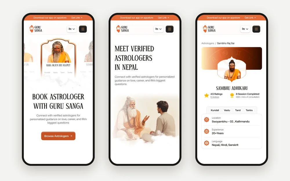
Case study: GuruSangaA guru booking platform built from a Figma design, with phone layouts at 390 px and the full price shown before Confirm Booking.
4. Does the Site Meet the WCAG 2.2 AA Basics?
WCAG 2.2, published by the W3C in October 2023, is the current accessibility standard, and Level AA is the level most policies ask for. Six checks catch most of the problems I find: tap target size, text contrast, contrast of buttons and fields, visible focus, text alternatives and the page language.
| Check | Pass when | WCAG 2.2 |
|---|---|---|
| 15. Tap target size | Targets at least 24 by 24 CSS px, or spaced so they do not crowd; I use 40 px or more for main buttons | 2.5.8 Target Size (Minimum), AA |
| 16. Text contrast | At least 4.5:1, or 3:1 for large text | 1.4.3 Contrast (Minimum), AA |
| 17. Button and field contrast | Field borders, icons and button edges at least 3:1 against what is next to them | 1.4.11 Non-text Contrast, AA |
| 18. Visible focus | Tabbing with a keyboard always shows where you are | 2.4.7 Focus Visible, AA |
| 19. Text alternatives | Images have useful alt text; icon-only buttons have a label | 1.1.1 Non-text Content, A |
| 20. Page language | lang="en" on the page and lang="ne" on Nepali passages | 3.1.1 (A) and 3.1.2 (AA) |
The most common failure I see is light grey text on white. It looks calm in a design file and becomes unreadable on a phone held outdoors in the afternoon sun. The second is outline: none on buttons with nothing in its place, which leaves keyboard users lost.
Motion needs care too. WCAG lists turning off interaction animation as a AAA criterion, so it is not required at AA, but I treat it as standard. On Nimtto, my wedding invitation product, every 3D design has a still fallback and honours the phone’s reduced-motion setting.
Want This Checklist Run on Your Site?I test your key journeys on real phones, check WCAG 2.2 AA and send a ranked fix list with annotated screenshots. Audits are quoted per project.
Ask about an audit5. Are Your Forms Short and Forgiving?
A good form asks only for what you need now, labels every field, opens the right keyboard on a phone, explains errors next to the field and keeps what the visitor typed. For most business sites in Nepal, a name, a phone number and a message are enough to start a conversation.
| Check | Pass when | Standard or test |
|---|---|---|
| 21. Only what you need | No field you will not use in the first reply | Remove a field, see if you miss it |
| 22. Visible labels | Every field has a label that stays visible, not just placeholder text | WCAG 3.3.2 Labels or Instructions (A) |
| 23. Right keyboard | Phone fields use type="tel"; fields have autocomplete values | WCAG 1.3.5 Identify Input Purpose (AA) |
| 24. Helpful errors | Errors in text beside the field, with how to fix them; typed data kept | WCAG 3.3.1 (A) and 3.3.3 (AA) |
| 25. No repeats or puzzles | Nothing asked twice; sign-in allows paste and password managers | WCAG 3.3.7 (A) and 3.3.8 (AA) |
<label for="phone">Mobile number</label>
<input id="phone" name="phone" type="tel" autocomplete="tel"
       placeholder="98XXXXXXXX">
Small details remove a lot of friction. In Eknas, my loyalty SaaS for Nepali shops, reward codes are six characters with no look-alike letters, so nobody confuses an O with a 0 at a busy counter. Staff find a member by mobile number or by scanning the rotating QR code in the customer’s wallet.
6. Do Nepali Text, Dates and Prices Display Correctly?
Nepali text should be real Unicode in a proper Devanagari font, never letter-spaced, with enough line height for vowel signs above and below the line. Prices should use NPR with lakh grouping, such as NPR 1,50,000, and dates should show Bikram Sambat beside AD wherever your customers think in BS.
| Check | Pass when | How to test |
|---|---|---|
| 26. Devanagari renders well | A Devanagari font such as Mukta or Noto Sans Devanagari; no letter-spacing; taller line height | Read a Nepali paragraph on Android and iPhone |
| 27. Language switch | One tap, in the same place on every page, labelled English and नेपाली | Switch on three different pages |
| 28. NPR with lakh grouping | NPR 1,50,000, not 150,000; the currency always shown | Check prices, cart and receipt |
| 29. BS and AD dates | Bikram Sambat beside AD for events, fees, deadlines and receipts | Ask an older customer to read a date |
Mixed-script pages need a font stack that does the work for you. Put your Latin font first and a Devanagari font second; the browser uses the second one for any character the first lacks. Then format numbers with the browser’s own tools rather than by hand:
/* CSS: Latin font first, Devanagari font for Nepali characters */
body { font-family: "Urbanist", "Mukta", sans-serif; }
:lang(ne) { letter-spacing: 0; line-height: 1.7; }

// JavaScript: lakh grouping in English or Nepali digits
new Intl.NumberFormat('en-IN').format(150000)  // "1,50,000"
new Intl.NumberFormat('ne-NP').format(150000)  // "१,५०,०००"
Dates are where Nepali products earn trust. Nimtto shows each ceremony’s Bikram Sambat date beside the AD date, because elders read one calendar and relatives abroad read the other. A family can even override the BS date to match their priest’s patro. Sajilai’s PDF receipts write the amount out in lakh and crore.
7. Does Your eSewa and Khalti Checkout Explain Each Step?
A good checkout in Nepal shows the full total before payment, tells the buyer they will leave for eSewa or Khalti and come back, keeps the cart if they cancel, and only says “Paid” after your server has confirmed the payment. The return page must handle success, pending and cancelled payments clearly.
Both wallets send the buyer to their own page and back to yours. Khalti returns the buyer with a status of Completed, Pending or User canceled, and its documentation says to use its lookup API for the final check and to treat only Completed as success. eSewa sends a success or failure response back to your site and offers a status check API to confirm a payment. My eSewa and Khalti integration guide covers the code.
| Check | Pass when | How to test |
|---|---|---|
| 30. Total before paying | Price, delivery, VAT and any deposit shown before the payment button | Add an item and stop before paying |
| 31. The hand-off explained | A line such as “You will pay on Khalti and come back here” | Ask a first-time buyer what will happen |
| 32. Every return handled | Clear pages for paid, pending and cancelled; the cart survives a cancel | Cancel a test payment in the sandbox |
| 33. A readable receipt | A short order reference, the amount and what happens next | Read the reference out over the phone |
Two of my products show these rules in practice. A Sajilai vehicle page shows the total and the deposit before the renter signs in, and its Fonepay and NepalQR codes carry the amount already inside. GuruSanga shows the full price before Confirm Booking and gives every booking a short reference, such as GS-1001, that is easy to read out on a call.
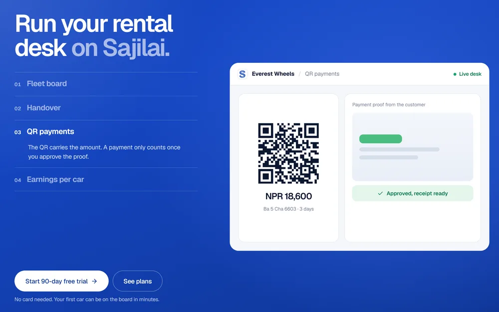
Case study: SajilaiA car and bike rental marketplace with the total shown up front, QR payments with the amount inside and receipts in lakh and crore.
8. Do Visitors Trust the Site Enough to Contact You?
Careful buyers in Nepal look for proof before they call: a price or price range, a phone and WhatsApp number, a real address with a map, real photos and genuine reviews. If they cannot find these quickly, they leave to ask somewhere else. Make each one easy to find and easy to tap.
| Check | Pass when | How to test |
|---|---|---|
| 34. Tap to contact | tel: links for calls and a WhatsApp link with a message already started | Tap both on a phone |
| 35. Real business details | Address, map, opening hours, real photos and PAN or VAT number where buyers expect it | Compare with your Google Business Profile |
| 36. Honest proof | Prices or ranges shown; reviews from real customers only; refund and delivery terms linked | Read the page as a sceptical buyer |
Never invent reviews or ratings. Sajilai only lets renters who completed a trip write a review, so its ratings come from real rentals, and a business that asks for the verified badge has its PAN or VAT registration checked first.
How Do You Run a Quick UX Test with Five Users?
Give five people who match your customers three to five real tasks on their own phones, ask them to think aloud, and watch without helping. Note where they hesitate, misread or give up, fix the biggest problems, then test again. Jakob Nielsen’s research found that a first study with five users finds about 85% of usability problems.
- Write tasks as goals. “Find out what a two-day car rental costs and ask about it”, not “Click Prices”.
- Pick five real users. People who match your buyers, on their own phones and their own mobile data.
- Ask them to think aloud. Record the screen with their permission, and do not explain anything.
- Note every stumble. Each pause, wrong tap, question or give-up, with the screen it happened on.
- Count and fix. Problems that three or more people hit go first; make the changes.
- Test again. Five new people, to check the fixes and find what was hidden behind them.
Nielsen recommends spending a testing budget on three studies of five users rather than one big study. If your site serves two very different groups, such as buyers and sellers, test three or four people from each group instead.
UX Checklist, UI/UX Audit or Usability Test: Which Do You Need?
Use this checklist yourself before launch, a UI/UX audit when you want an expert to find and rank problems, and a usability test when you need to see how real customers behave. They answer different questions, and many sites benefit from all three at different times.
| This checklist | UI/UX audit | Usability test | |
|---|---|---|---|
| Who does it | You or your developer | An expert reviewer | Real users, watched |
| What it finds | Clear rule breaks | Ranked problems with fixes | How people really behave |
| Best time | Before every launch | When visits do not turn into enquiries | Before and after big changes |
If you would rather have it done for you, my usability audit in Nepal runs these checks on your key journeys and ranks every issue by severity and effort. For a new site, UI/UX design is included when I build it as your web developer in Nepal, for clients in Itahari, Kathmandu and abroad. Every starting price is on my services page, and if a new design is part of the plan, read how to handle a website redesign without losing SEO.

About the author
Ujjwal Rupakheti
I am a full-stack web developer and SEO specialist based in Itahari, Koshi Province, Nepal. I have worked in web development and SEO since 2022 and have published more than 200 SEO-optimised articles across five-plus domains. Since June 2026 I have been a full-stack web developer at Ektukra Digital Agency, after a year there on SEO content strategy and QA testing.